Tech Perspectives
Ces's random twalks on tech and stats.
From Model to Report: How tidylearn Simplifies ML Reporting
by Cesaire Tobias
Contents
The Reporting Problem
Machine learning in R is powerful, but reporting the results often takes
more effort than building the model itself. Every package returns
results in a different format — a named vector here, a matrix there, a
custom S3 object somewhere else. Even with excellent tidying packages
like broom, the column names and available fields change between model
types, and many ML packages aren’t supported at all.
The result is that producing consistent, polished visualisations and tables for a report means writing custom extraction and reshaping code for each package you use. Change your model, and your reporting code breaks.
tidylearn solves this. Every function — across 20 algorithms —
returns tidy tibbles, ggplot2 plots, and formatted gt tables with a
consistent structure. Your reporting pipeline becomes model-agnostic:
swap the algorithm, and the same plot code, table code, and comparison
logic work without modification.
This post walks through real-world analysis tasks — PCA, hierarchical clustering, regularisation, and multi-model classification — comparing the tidylearn workflow against the traditional approach.
library(tidylearn)
library(dplyr)
library(ggplot2)
library(gt)
library(tibble)
1. PCA: Biplot, Scree Plot, and Variance Tables
PCA is a staple of exploratory analysis, and producing a polished biplot or scree plot is one of those tasks that should be straightforward but rarely is.
With tidylearn
pca <- tidy_pca(USArrests, scale = TRUE)
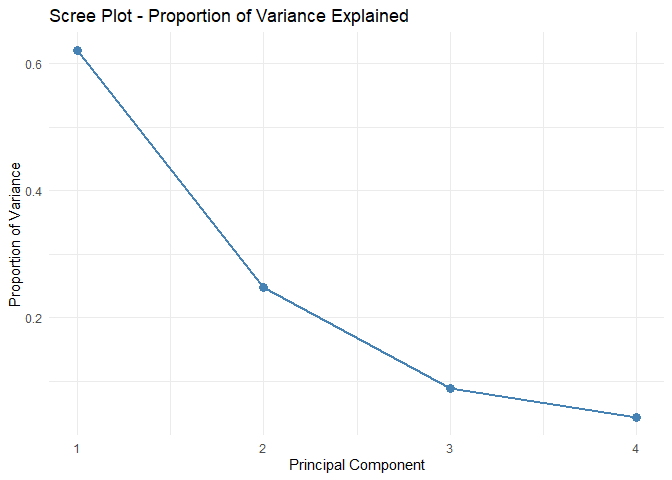
Scree plot with cumulative variance line and 80% threshold:
tidy_pca_screeplot(pca)
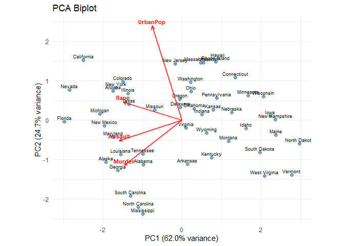
Publication-ready biplot with observation scores and variable loadings:
tidy_pca_biplot(pca, label_obs = TRUE)
And the tables — variance explained and loadings — are one call each, with colour-coded formatting out of the box:
pca_model <- tl_model(USArrests, method = "pca")
tl_table_variance(pca_model)
| PCA Variance Explained | ||||
| Component | Std. Dev. | Variance | Proportion | Cumulative |
|---|---|---|---|---|
| PC1 | 1.5749 | 2.4802 | 62.0% | 62.0% |
| PC2 | 0.9949 | 0.9898 | 24.7% | 86.8% |
| PC3 | 0.5971 | 0.3566 | 8.9% | 95.7% |
| PC4 | 0.4164 | 0.1734 | 4.3% | 100.0% |
| tidylearn | pca | n = 50 | ||||
tl_table_loadings(pca_model, n_components = 2)
| PCA Loadings | ||
| Variable | PC1 | PC2 |
|---|---|---|
| Murder | −0.536 | −0.418 |
| Assault | −0.583 | −0.188 |
| UrbanPop | −0.278 | 0.873 |
| Rape | −0.543 | 0.167 |
| tidylearn | pca | n = 50 | ||
The loadings table uses a diverging red–blue colour scale to highlight strong positive and negative loadings — no manual formatting required.
Without tidylearn
pca_base <- prcomp(USArrests, scale. = TRUE)
The default R biplot:
biplot(pca_base)
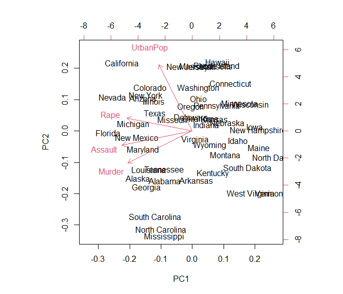
This produces a functional but visually rough base R graphic — no
theme_minimal(), no consistent colour scheme, no variance-explained
axis labels. To get a ggplot2 biplot, you need to manually extract and
scale the scores and loadings:
# Extract scores
scores <- as.data.frame(pca_base$x[, 1:2])
scores$label <- rownames(scores)

# Extract loadings and scale to match scores
loadings <- as.data.frame(pca_base$rotation[, 1:2])
loadings$variable <- rownames(loadings)
score_range <- max(abs(scores[, 1:2]))
loading_range <- max(abs(loadings[, 1:2]))
scale_factor <- (score_range / loading_range) * 0.8

loadings$PC1_scaled <- loadings$PC1 * scale_factor
loadings$PC2_scaled <- loadings$PC2 * scale_factor

# Compute variance explained for axis labels
var_exp <- pca_base$sdev^2 / sum(pca_base$sdev^2) * 100

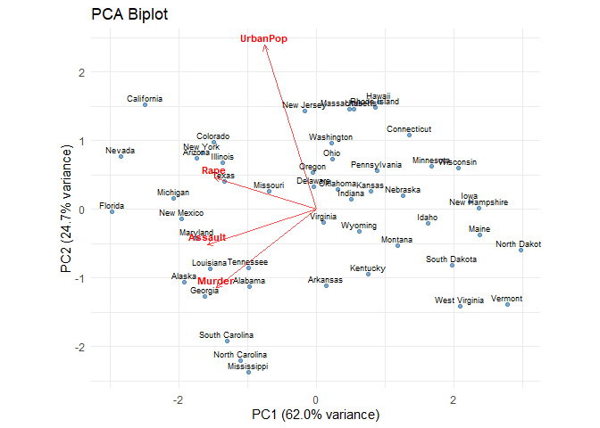
# Build the ggplot manually
ggplot() +
  geom_point(data = scores, aes(x = PC1, y = PC2),
             colour = "steelblue", alpha = 0.7) +
  geom_text(data = scores, aes(x = PC1, y = PC2, label = label),
            size = 2.5, vjust = -0.5) +
  geom_segment(data = loadings,
               aes(x = 0, y = 0, xend = PC1_scaled, yend = PC2_scaled),
               arrow = arrow(length = unit(0.2, "cm")),
               colour = "red", alpha = 0.7) +
  geom_text(data = loadings,
            aes(x = PC1_scaled, y = PC2_scaled, label = variable),
            colour = "red", size = 3, fontface = "bold", vjust = -0.5) +
  labs(
    title = "PCA Biplot",
    x = sprintf("PC1 (%.1f%% variance)", var_exp[1]),
    y = sprintf("PC2 (%.1f%% variance)", var_exp[2])
  ) +
  coord_equal() +
  theme_minimal()
# Variance table — manually computed
var_explained <- data.frame(
  component = paste0("PC", seq_along(pca_base$sdev)),
  sdev = pca_base$sdev,
  variance = pca_base$sdev^2,
  prop_variance = pca_base$sdev^2 / sum(pca_base$sdev^2),
  cum_variance = cumsum(pca_base$sdev^2 / sum(pca_base$sdev^2))
)

knitr::kable(var_explained, digits = 3,
             caption = "Variance Explained (manual)")
| component | sdev | variance | prop_variance | cum_variance |
|---|---|---|---|---|
| PC1 | 1.575 | 2.480 | 0.620 | 0.620 |
| PC2 | 0.995 | 0.990 | 0.247 | 0.868 |
| PC3 | 0.597 | 0.357 | 0.089 | 0.957 |
| PC4 | 0.416 | 0.173 | 0.043 | 1.000 |
Variance Explained (manual)
The manual biplot requires extracting matrices, scaling loadings to
match score ranges, computing variance percentages for axis labels, and
assembling the ggplot layer by layer. tidy_pca_biplot() handles all of
that in one call. And the kable() variance table is functional but
plain — no colour coding, no cumulative-variance highlighting.
tl_table_variance() adds these by default.
2. Hierarchical Clustering
Hierarchical clustering involves computing distances, fitting the tree, visualising the dendrogram, cutting it, and augmenting your data with cluster assignments. Each step traditionally produces a different data structure.
With tidylearn
hc <- tidy_hclust(USArrests, method = "ward.D2")

# Dendrogram with cluster rectangles
tidy_dendrogram(hc, k = 4)
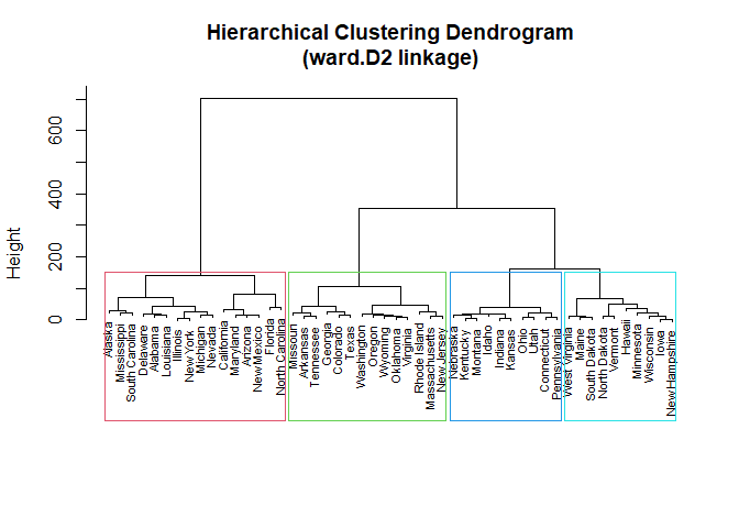
Cut the tree and get a tidy tibble of cluster assignments:
clusters <- tidy_cutree(hc, k = 4)
knitr::kable(head(clusters, 10), caption = "Cluster Assignments (first 10)")
| .obs_id | cluster |
|---|---|
| Alabama | 1 |
| Alaska | 1 |
| Arizona | 1 |
| Arkansas | 2 |
| California | 1 |
| Colorado | 2 |
| Connecticut | 3 |
| Delaware | 1 |
| Florida | 1 |
| Georgia | 2 |
Cluster Assignments (first 10)
Augment the original data and produce a formatted cluster summary table:
hc_model <- tl_model(USArrests, method = "hclust")
tl_table_clusters(hc_model, k = 4)
| Cluster Summary | |||||
| hclust | 4 clusters | |||||
| Cluster | Size | Murder | Assault | UrbanPop | Rape |
|---|---|---|---|---|---|
| 1 | 14 | 11.47 | 263.50 | 69.14 | 29.00 |
| 2 | 14 | 8.21 | 173.29 | 70.64 | 22.84 |
| 3 | 20 | 4.27 | 87.55 | 59.75 | 14.39 |
| 4 | 2 | 14.20 | 336.00 | 62.50 | 24.00 |
| tidylearn | hclust | n = 50 | |||||
Without tidylearn
# Compute distance matrix
d <- dist(scale(USArrests), method = "euclidean")

# Fit hierarchical clustering
hc_base <- hclust(d, method = "ward.D2")

# Plot dendrogram
plot(hc_base, main = "Hierarchical Clustering Dendrogram",
     xlab = "", sub = "", cex = 0.7)
rect.hclust(hc_base, k = 4, border = 2:5)
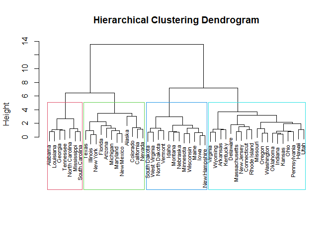
The dendrogram looks similar — both use base R graphics for this. The real difference is in what happens next:
# cutree returns a named integer vector — not a tibble
clusters_base <- cutree(hc_base, k = 4)
str(clusters_base)
#>  Named int [1:50] 1 2 2 3 2 2 3 3 2 1 ...
#>  - attr(*, "names")= chr [1:50] "Alabama" "Alaska" "Arizona" "Arkansas" ...
# To get a summary table, manually bind and reshape
USArrests_clustered <- USArrests
USArrests_clustered$cluster <- clusters_base

USArrests_clustered %>%
  group_by(cluster) %>%
  summarise(across(where(is.numeric), mean), .groups = "drop") %>%
  knitr::kable(digits = 1, caption = "Cluster Means (manual)")
| cluster | Murder | Assault | UrbanPop | Rape |
|---|---|---|---|---|
| 1 | 14.7 | 251.3 | 54.3 | 21.7 |
| 2 | 11.0 | 264.0 | 76.5 | 33.6 |
| 3 | 6.2 | 142.1 | 71.3 | 19.2 |
| 4 | 3.1 | 76.0 | 52.1 | 11.8 |
Cluster Means (manual)
The dendrogram itself is comparable. But cutree() returns a named
integer vector that needs manual binding to your data, and the resulting
kable() is plain text. tl_table_clusters() produces a formatted
table with cluster sizes, styled headers, and consistent theming — ready
for a report.
3. Lasso Regularisation: Coefficient Paths and Tables
Regularised models are a common choice, but visualising how coefficients shrink along the regularisation path is one of those tasks where the default output is decidedly not report-ready.
With tidylearn
lasso <- tl_model(mtcars, mpg ~ ., method = "lasso")

# Coefficient path as a ggplot2 object
tl_plot_regularization_path(lasso)
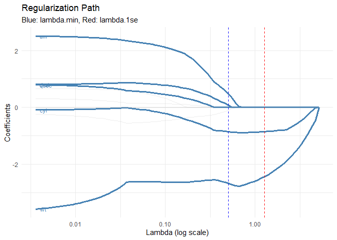
# Cross-validation curve
tl_plot_regularization_cv(lasso)
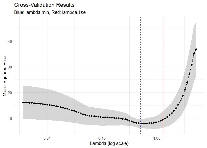
And a formatted coefficient table, sorted by magnitude with zero coefficients greyed out:
tl_table_coefficients(lasso)
| Lasso Coefficients | ||
| lambda = 1.275 (1se) | ||
| Term | Coefficient | |Coefficient| |
|---|---|---|
| (Intercept) | 34.3695 | 34.3695 |
| wt | −2.4351 | 2.4351 |
| cyl | −0.8528 | 0.8528 |
| hp | −0.0080 | 0.0080 |
| disp | 0.0000 | 0.0000 |
| drat | 0.0000 | 0.0000 |
| qsec | 0.0000 | 0.0000 |
| vs | 0.0000 | 0.0000 |
| am | 0.0000 | 0.0000 |
| gear | 0.0000 | 0.0000 |
| carb | 0.0000 | 0.0000 |
| tidylearn | lasso (regression) | mpg ~ . | n = 32 | ||
Both plots are ggplot2 objects — theme_minimal(), consistent
aesthetics, and directly passable to ggplotly() or ggsave(). The
table is a gt object with the same consistent styling.
Without tidylearn
library(glmnet)

# Prepare model matrix (glmnet doesn't accept formulas)
x <- model.matrix(mpg ~ ., data = mtcars)[, -1]
y <- mtcars$mpg

# Fit with cross-validation
cv_fit <- cv.glmnet(x, y, alpha = 1)
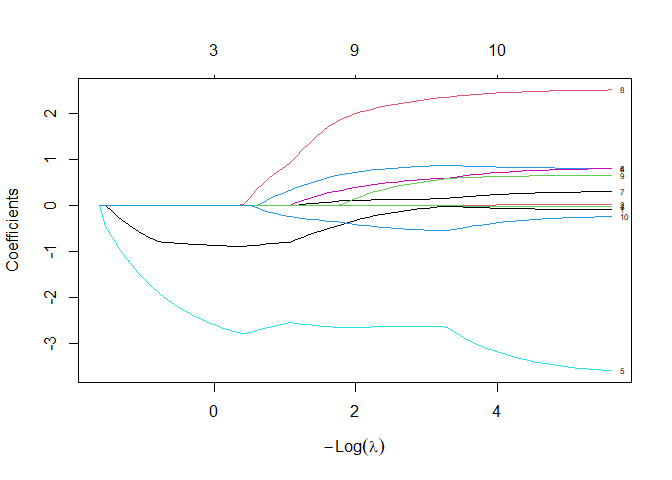
The default coefficient path plot:
plot(cv_fit$glmnet.fit, xvar = "lambda", label = TRUE)
The default cross-validation plot:
plot(cv_fit)
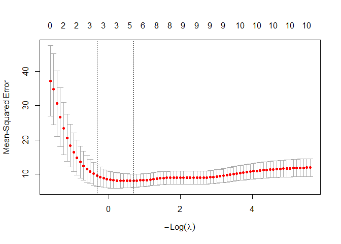
These are base R graphics — functional, but they can’t be themed,
faceted, combined with other ggplot2 panels, or converted to interactive
plotly charts. Building ggplot2 equivalents from the glmnet object
requires extracting the coefficient matrix across all lambda values and
pivoting it to long format:
# Extract coefficient matrix
coef_matrix <- as.matrix(cv_fit$glmnet.fit$beta)
lambda_vals <- cv_fit$glmnet.fit$lambda

# Reshape to long format for ggplot
coef_df <- as.data.frame(t(coef_matrix))
coef_df$lambda <- lambda_vals
coef_long <- tidyr::pivot_longer(coef_df, -lambda,
                                  names_to = "variable",
                                  values_to = "coefficient")

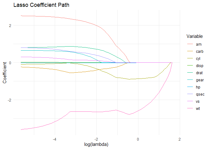
ggplot(coef_long, aes(x = log(lambda), y = coefficient, colour = variable)) +
  geom_line() +
  labs(title = "Lasso Coefficient Path", x = "log(lambda)",
       y = "Coefficient", colour = "Variable") +
  theme_minimal()
# Extract coefficients at lambda.1se — returns a sparse matrix
coefs <- as.matrix(coef(cv_fit, s = "lambda.1se"))
coef_tbl <- data.frame(
  term = rownames(coefs),
  estimate = as.vector(coefs)
)
coef_tbl <- coef_tbl[order(-abs(coef_tbl$estimate)), ]

knitr::kable(coef_tbl, digits = 4, row.names = FALSE,
             caption = "Lasso Coefficients at lambda.1se (manual)")
| term | estimate |
|---|---|
| (Intercept) | 33.9405 |
| wt | -2.3659 |
| cyl | -0.8430 |
| hp | -0.0070 |
| disp | 0.0000 |
| drat | 0.0000 |
| qsec | 0.0000 |
| vs | 0.0000 |
| am | 0.0000 |
| gear | 0.0000 |
| carb | 0.0000 |
Lasso Coefficients at lambda.1se (manual)
The manual approach works, but it’s the kind of reshaping code that’s
easy to get subtly wrong and tedious to repeat.
tl_plot_regularization_path() handles extraction, pivoting, labelling,
and theming in one call. And the kable() coefficient table is plain —
tl_table_coefficients() adds sorting, zero greying, and the selected
lambda value in the subtitle.
4. Multi-Model Classification Comparison
Comparing models across packages is where consistent output structure matters most. Each package has its own prediction interface, metric accessors, and plot conventions.
With tidylearn
split <- tl_split(iris, prop = 0.7, stratify = "Species", seed = 42)

# Fit three models — same interface for each
m_forest   <- tl_model(split$train, Species ~ ., method = "forest")
m_tree     <- tl_model(split$train, Species ~ ., method = "tree")
m_xgboost  <- tl_model(split$train, Species ~ ., method = "xgboost")
A formatted comparison table — one call:
tl_table_comparison(
  m_forest, m_tree, m_xgboost,
  new_data = split$test,
  names = c("Random Forest", "Decision Tree", "XGBoost")
)
| Model Comparison | |||
| 3 models compared | |||
| Metric | Random Forest | Decision Tree | XGBoost |
|---|---|---|---|
| Accuracy | 0.9556 | 0.8889 | 0.9111 |
| tidylearn | n = 45 | |||
And a confusion matrix for any model:
tl_table_confusion(m_forest, new_data = split$test)
| Confusion Matrix | |||
| Actual |
Predicted
|
||
|---|---|---|---|
| setosa | versicolor | virginica | |
| setosa | 15 | 0 | 0 |
| versicolor | 0 | 15 | 0 |
| virginica | 0 | 2 | 13 |
| tidylearn | forest (classification) | Species ~ . | n = 105 | |||
Adding a fourth model is just another argument in
tl_table_comparison() — the table code stays unchanged.
Without tidylearn
library(randomForest)
library(xgboost)

set.seed(42)
train_idx <- unlist(lapply(
  split(seq_len(nrow(iris)), iris$Species),
  function(i) sample(i, size = floor(0.7 * length(i)))
))
train_data <- iris[train_idx, ]
test_data  <- iris[-train_idx, ]

# Two of the three take a formula and a data frame
fit_rf   <- randomForest(Species ~ ., data = train_data)
fit_tree <- rpart::rpart(Species ~ ., data = train_data, method = "class")

# xgboost takes neither: a numeric matrix, integer-encoded labels, and
# xgb.train() rather than xgboost(), which refuses multiclass outright
dtrain <- xgb.DMatrix(
  data  = as.matrix(train_data[, 1:4]),
  label = as.integer(train_data$Species) - 1
)
fit_xgb <- xgb.train(
  params  = list(objective = "multi:softmax", num_class = 3),
  data    = dtrain,
  nrounds = 20,
  verbose = 0
)

# Each returns predictions in a different format
pred_rf   <- predict(fit_rf, newdata = test_data)
pred_tree <- predict(fit_tree, newdata = test_data, type = "class")
pred_xgb  <- predict(fit_xgb, xgb.DMatrix(as.matrix(test_data[, 1:4])))

# And the xgboost predictions are zero-based integers, not factor levels
acc_rf   <- mean(pred_rf == test_data$Species)
acc_tree <- mean(pred_tree == test_data$Species)
acc_xgb  <- mean(levels(iris$Species)[pred_xgb + 1] == test_data$Species)

comparison_base <- data.frame(
  model = c("Random Forest", "Decision Tree", "XGBoost"),
  accuracy = c(acc_rf, acc_tree, acc_xgb)
)

knitr::kable(comparison_base, digits = 3,
             caption = "Model Comparison (manual)")
| model | accuracy |
|---|---|
| Random Forest | 0.933 |
| Decision Tree | 0.889 |
| XGBoost | 0.911 |
Model Comparison (manual)
Three packages, three interfaces. randomForest and rpart take a
formula and a data frame; xgboost takes a numeric matrix wrapped in a
DMatrix, integer-encoded labels, and xgb.train() rather than
xgboost(), which refuses multiclass objectives outright. The
predictions come back as factor levels, factor levels, and zero-based
integers respectively, so each accuracy has to be computed its own way.
The kable() output is plain and limited to one metric.
tl_table_comparison() takes the fitted models and produces a styled,
multi-metric table without any of that reshaping.
5. Interactive Reporting with plotly
Because tidylearn’s plot functions return standard ggplot2 objects, converting any visualisation to an interactive plotly chart is a one-liner:
library(plotly)

# tidylearn's plot returns a ggplot2 object — pass it straight to ggplotly
ggplotly(tidy_pca_biplot(pca, label_obs = TRUE))
ggplotly(tl_plot_regularization_path(lasso))
ggplotly(plot(m_forest, type = "confusion"))
ggplotly() picks up axis labels, themes, and tooltip data
automatically. Compare this to the base R plots from biplot(),
plot.glmnet(), or plot.hclust() — none of which can be converted to
plotly without rebuilding them from scratch.
What the Uniformity Buys
Consistent, polished output by default. Every model — whether it’s a
PCA biplot, a lasso coefficient path, or a confusion matrix — returns
ggplot2 plots and gt tables with a consistent visual language. You
don’t need to learn each package’s idiosyncratic output format or build
custom formatting code to get report-quality visuals and tables.
Reproducibility through uniformity. When your reporting pipeline
works the same way for every model type, your analysis becomes genuinely
reproducible. Swap method = "forest" for method = "xgboost" and
rerun — the same tl_table() calls, the same plot() calls, the same
comparison logic all work without modification. That means you can
iterate on model selection without touching your reporting layer, and
anyone reading your code can follow the same pattern across different
analyses.
The best analysis code is code that gets out of your way and lets you focus on the results. That’s what tidylearn is for.
tags: r - machine-learning - tidylearn